OBJECTIVE:
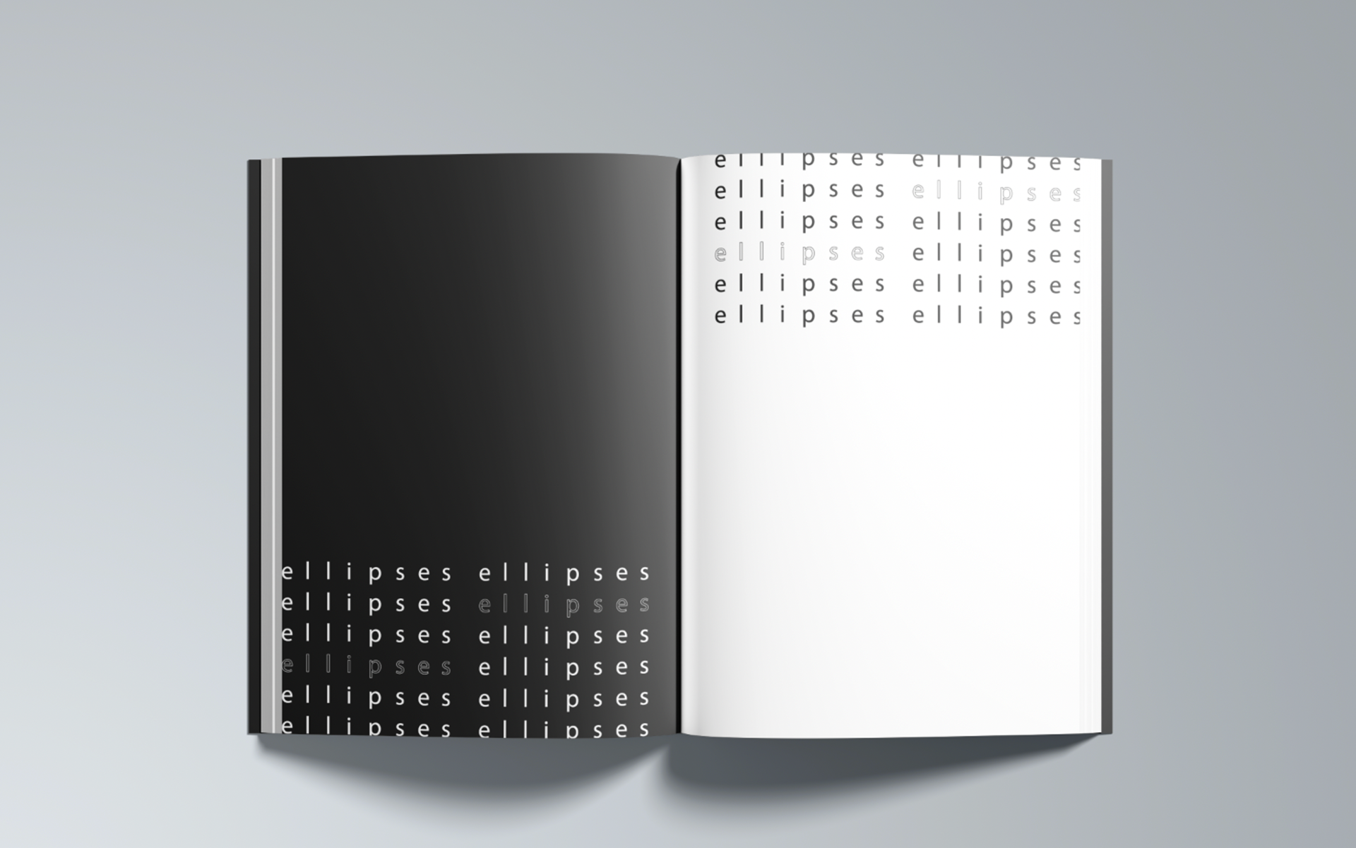
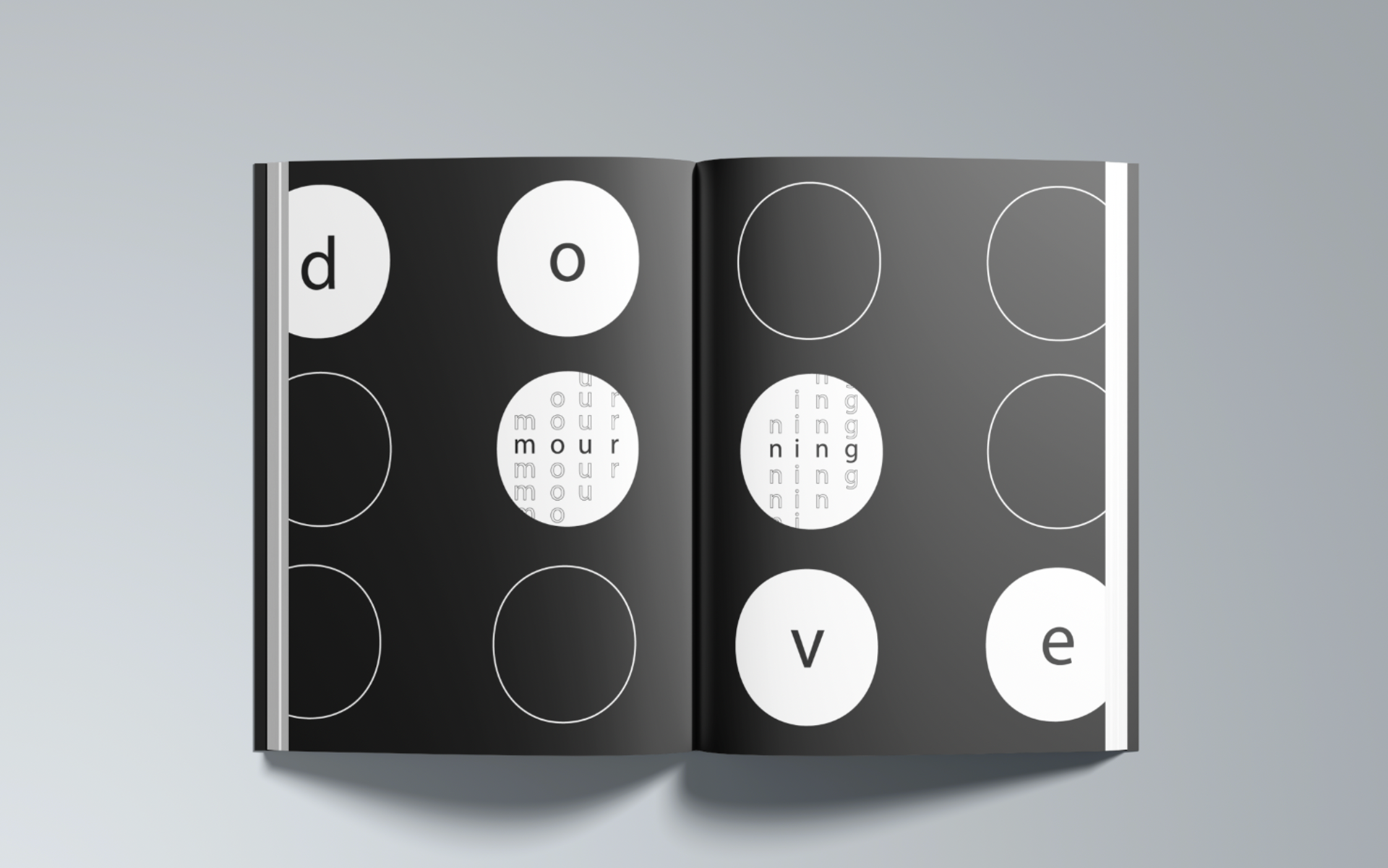
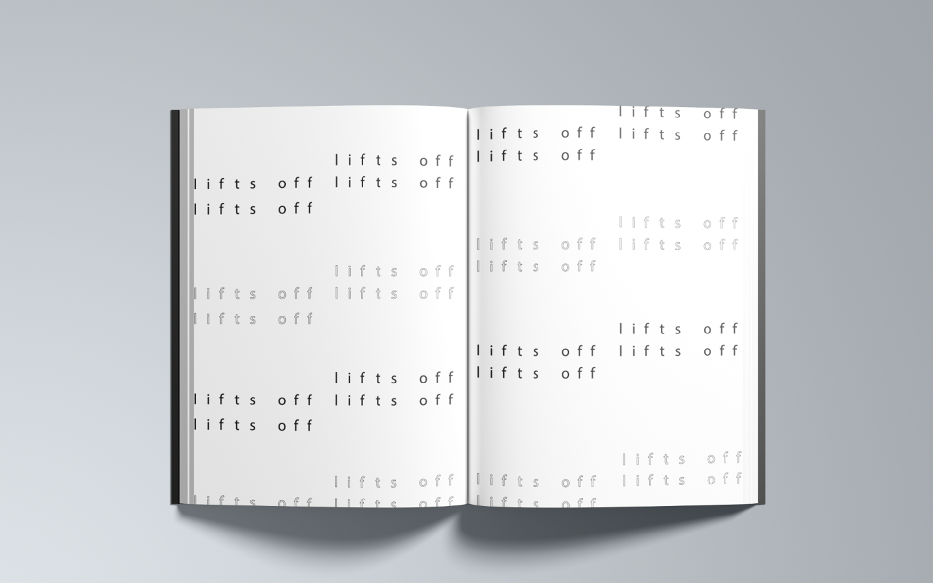
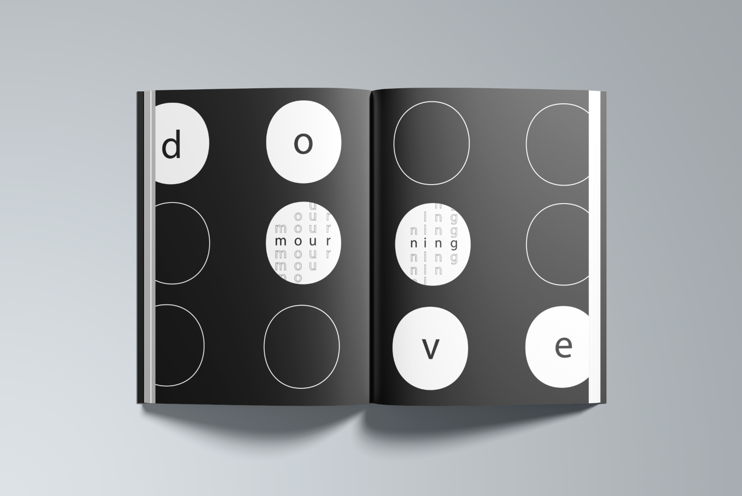
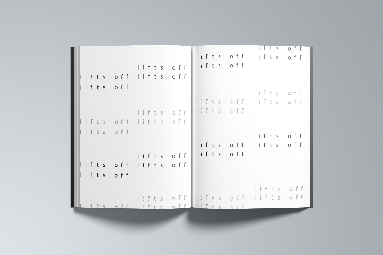
Create an interpretative design from a haiku that explores message communication as well as developing spatial identity. Explore using type as imagery to create both harmony and structure.
BRAINSTORMING AND SKETCHES:
VISUAL IDENTITY:
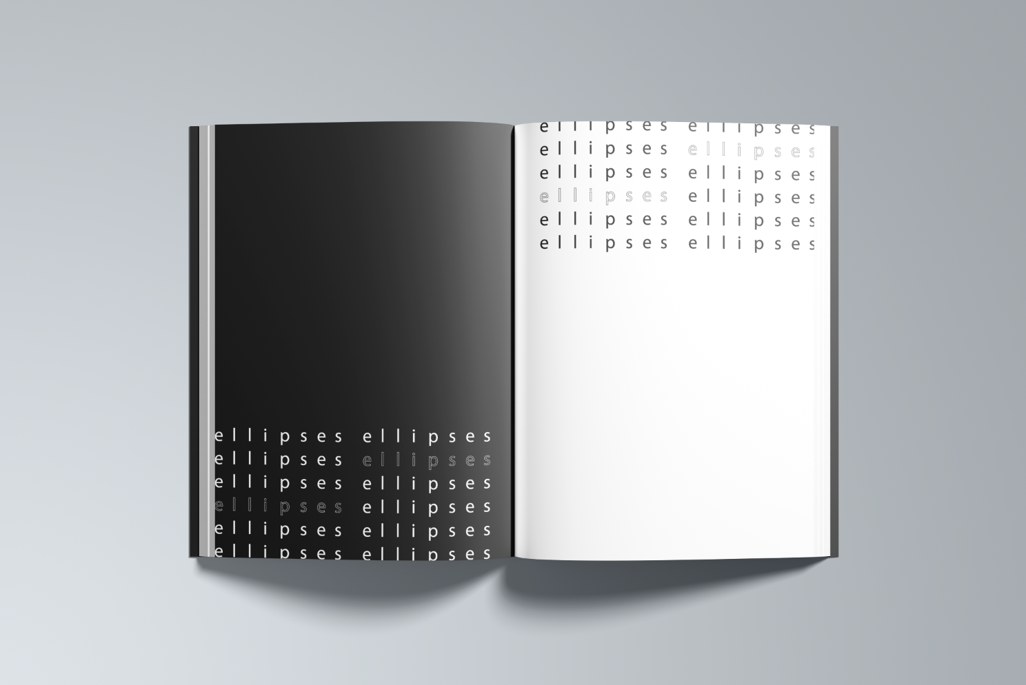
For the typeface selection, I wanted to keep things simple to better highlight the punctuation and communication within the design. Even though Myriad Pro is a standard typeface, I was drawn to the roundness of the letterforms. With the punctuation being ellipses, the roundness of the counter form with the letters created the perfect harmony within the design.
ITERATIONS:
FINAL DESIGN AND MOCKUP:
